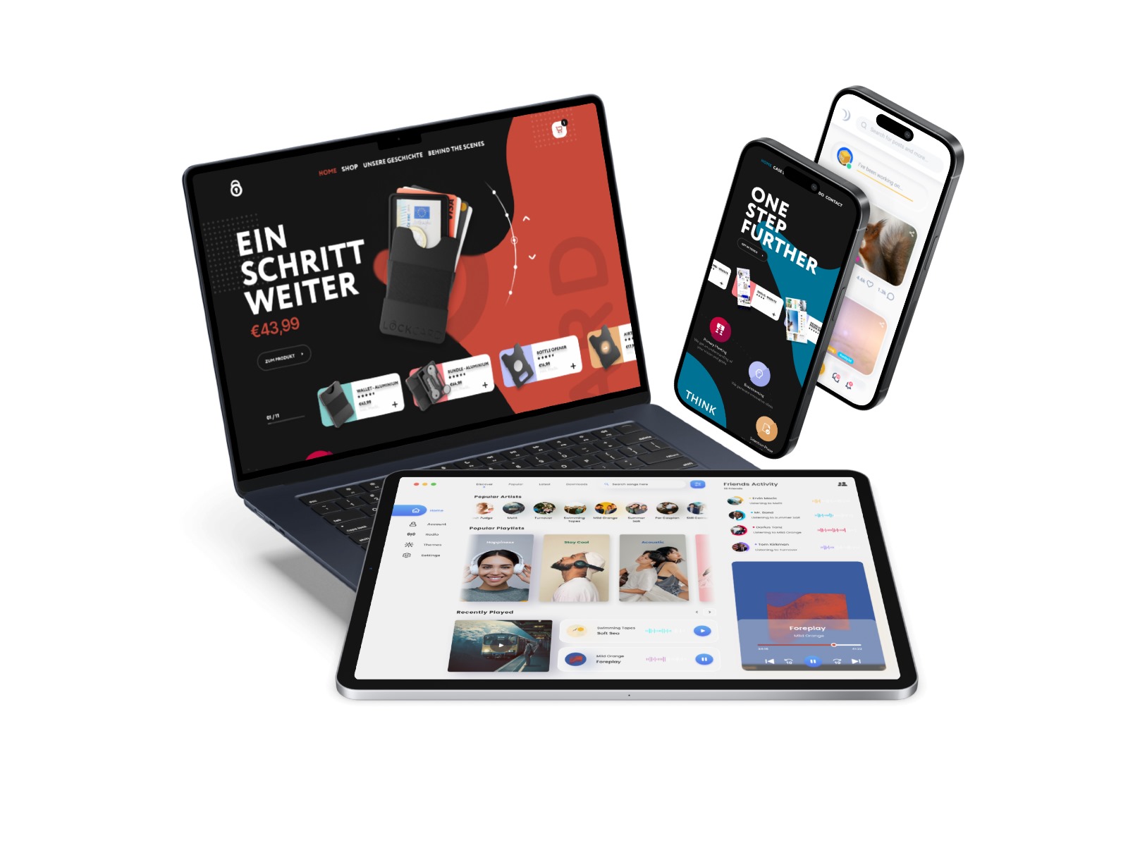


Designing for Mobile First
We begin by crafting your website for mobile phones, and then we expand it to fit tablets and desktop computers.

Responsive on All Devices
Your site will adjust seamlessly to fit the screens of mobiles, tablets, and desktops, ensuring potential customers can visit your site from any device.

Optimize
With over 60% of online browsing happens on mobile devices, we meticulously optimize your site for mobile to guarantee top performance in search engine rankings.